Sekarang Kita Akan Membuat Tampilan 3D Login. Berbeda dari sebelumnya tampilan login ini User Friendly yang sangat mudah dipahami dan digunakan. Sebelum kita mulai pastikan kita sudah menginstall Tools untuk membuat Website seperti : Sublime Text, Visual Studio Code, Notepad++, dan lain-lain Langkah yang akan kita lakukan adalah :
- Langkah pertama buat file baru dengan nama index.html. lalu masukkan source code berikut :
<!DOCTYPE html>
<html>
<head>
<link rel=”stylesheet” href=”https://stackpath.bootstrapcdn.com/bootstrap/4.5.0/css/bootstrap.min.css” integrity=”sha384-9aIt2nRpC12Uk9gS9baDl411NQApFmC26EwAOH8WgZl5MYYxFfc+NcPb1dKGj7Sk” crossorigin=”anonymous”>
<link rel=”stylesheet” href=”https://unicons.iconscout.com/release/v2.1.9/css/unicons.css”>
<link rel=”stylesheet” href=”style.css”>
<title>3D Flip SignIn Form</title>
</head>
<body>
<div class=”section”>
<div class=”container”>
<div class=”row full-height justify-content-center”>
<div class=”col-12 text-center align-self-center py-5″>
<div class=”section pb-5 pt-5 pt-sm-2 text-center”>
<h6 class=”mb-0 pb-3″><span>Sign In </span><span>Sign Up</span></h6>
<input class=”checkbox” type=”checkbox” id=”reg-log” name=”reg-log”/>
<label for=”reg-log”></label>
<div class=”card-3d-wrap mx-auto”>
<div class=”card-3d-wrapper”>
<div class=”card-front”>
<div class=”center-wrap”>
<div class=”section text-center”>
<h4 class=”mb-4 pb-3″>Sign In</h4>
<div class=”form-group”>
<input type=”email” name=”logemail” class=”form-style” placeholder=”Your Email” id=”logemail” autocomplete=”off”>
<i class=”input-icon uil uil-at”></i>
</div>
<div class=”form-group mt-2″>
<input type=”password” name=”logpass” class=”form-style” placeholder=”Your Password” id=”logpass” autocomplete=”off”>
<i class=”input-icon uil uil-lock-alt”></i>
</div>
<a href=”#” class=”btn mt-4″>submit</a>
<p class=”mb-0 mt-4 text-center”><a href=”#0″ class=”link”>Forgot your password?</a></p>
</div>
</div>
</div>
<div class=”card-back”>
<div class=”center-wrap”>
<div class=”section text-center”>
<h4 class=”mb-4 pb-3″>Sign Up</h4>
<div class=”form-group”>
<input type=”text” name=”logname” class=”form-style” placeholder=”Your Full Name” id=”logname” autocomplete=”off”>
<i class=”input-icon uil uil-user”></i>
</div>
<div class=”form-group mt-2″>
<input type=”email” name=”logemail” class=”form-style” placeholder=”Your Email” id=”logemail” autocomplete=”off”>
<i class=”input-icon uil uil-at”></i>
</div>
<div class=”form-group mt-2″>
<input type=”password” name=”logpass” class=”form-style” placeholder=”Your Password” id=”logpass” autocomplete=”off”>
<i class=”input-icon uil uil-lock-alt”></i>
</div>
<a href=”#” class=”btn mt-4″>submit</a>
</div>
</div>
</div>
</div>
</div>
</div>
</div>
</div>
</div>
</div>
</body>
</html>
2. Langkah Kedua untuk membuat Tampilan lebih menarik buat file dengan nama style.css. lalu masukkan
source code berikut :
@import url(‘https://fonts.googleapis.com/css?family=Poppins:400,500,600,700,800,900’);
body{
font-family: ‘Poppins’, sans-serif;
font-weight: 300;
font-size: 15px;
line-height: 1.7;
color: #fff;
background: #73777B;
overflow-x: hidden;
}
a { cursor: pointer; transition: all 200ms linear; }
a:hover { text-decoration: none; }
.link { color: #fff; }
.link:hover { color: #EC994B; }
p { font-weight: 500; font-size: 14px; line-height: 1.7; }
h4 { font-weight: 600; }
h6 span{
padding: 0 20px;
text-transform: uppercase;
font-weight: 700;
}
.section{
position: relative;
width: 100%;
display: block;
}
.full-height{ min-height: 100vh; }
[type=”checkbox”]:checked,
[type=”checkbox”]:not(:checked){
position: absolute;
left: -9999px;
}
.checkbox:checked + label,
.checkbox:not(:checked) + label{
position: relative;
display: block;
text-align: center;
width: 60px;
height: 16px;
border-radius: 8px;
padding: 0;
margin: 10px auto;
cursor: pointer;
background-color: #EC994B;
}
.checkbox:checked + label:before,
.checkbox:not(:checked) + label:before{
position: absolute;
display: block;
width: 36px;
height: 36px;
border-radius: 50%;
color: #ffffff;
background-color: #2a2b38;
font-family: ‘unicons’;
content: ‘\eb4f’;
z-index: 20;
top: -10px;
left: -10px;
line-height: 36px;
text-align: center;
font-size: 24px;
transition: all 0.5s ease;
}
.checkbox:checked + label:before {
transform: translateX(44px) rotate(-270deg);
}
.card-3d-wrap {
position: relative;
width: 440px;
max-width: 100%;
height: 400px;
-webkit-transform-style: preserve-3d;
transform-style: preserve-3d;
perspective: 800px;
margin-top: 40px;
}
.card-3d-wrapper {
width: 100%;
height: 100%;
position:absolute;
top: 0;
left: 0;
-webkit-transform-style: preserve-3d;
transform-style: preserve-3d;
transition: all 600ms ease-out;
}
.card-front, .card-back {
width: 100%;
height: 100%;
background-color: #2a2b38;
position: absolute;
border-radius: 6px;
left: 0;
top: 0;
-webkit-transform-style: preserve-3d;
transform-style: preserve-3d;
backface-visibility: hidden;
}
.card-back {
transform: rotateY(180deg);
}
.checkbox:checked ~ .card-3d-wrap .card-3d-wrapper {
transform: rotateY(180deg);
}
.center-wrap{
position: absolute;
width: 100%;
padding: 0 35px;
top: 50%;
left: 0;
transform: translate3d(0, -50%, 35px) perspective(100px);
z-index: 20;
display: block;
}
.form-group{
position: relative;
display: block;
margin: 0;
padding: 0;
}
.form-style {
padding: 13px 20px;
padding-left: 55px;
height: 48px;
width: 100%;
font-weight: 500;
border-radius: 4px;
font-size: 14px;
line-height: 22px;
letter-spacing: 0.5px;
outline: none;
color: #c4c3ca;
background-color: #1f2029;
border: none;
transition: all 200ms linear;
box-shadow: 0 4px 8px 0 rgba(21,21,21,.2);
}
.form-style:focus,
.form-style:active {
border: none;
outline: none;
box-shadow: 0 4px 8px 0 rgba(21,21,21,.2);
}
.input-icon {
position: absolute;
top: 0;
left: 18px;
height: 48px;
font-size: 24px;
line-height: 48px;
text-align: left;
color: #F1EEE9;
transition: all 200ms linear;
}
.form-group input:-ms-input-placeholder {
color: #c4c3ca;
opacity: 0.7;
transition: all 200ms linear;
}
.form-group input::-moz-placeholder {
color: #c4c3ca;
opacity: 0.7;
transition: all 200ms linear;
}
.form-group input:-moz-placeholder {
color: #c4c3ca;
opacity: 0.7;
transition: all 200ms linear;
}
.form-group input::-webkit-input-placeholder {
color: #c4c3ca;
opacity: 0.7;
transition: all 200ms linear;
}
.form-group input:focus:-ms-input-placeholder {
opacity: 0;
transition: all 200ms linear;
}
.form-group input:focus::-moz-placeholder {
opacity: 0;
transition: all 200ms linear;
}
.form-group input:focus:-moz-placeholder {
opacity: 0;
transition: all 200ms linear;
}
.form-group input:focus::-webkit-input-placeholder {
opacity: 0;
transition: all 200ms linear;
}
.btn{
border-radius: 4px;
height: 44px;
font-size: 13px;
font-weight: 600;
text-transform: uppercase;
transition: all 200ms linear;
padding: 0 30px;
letter-spacing: 1px;
display: inline-flex;
align-items: center;
justify-content: center;
-ms-flex-pack: center;
text-align: center;
border: none;
background-color: #ffff;
color: #15133C;
box-shadow: 0 8px 24px 0 rgba(18, 248, 173,.2);
}
.btn:active,
.btn:focus{
background-color: #EC994B;
color: #15133C;
box-shadow: 0 8px 24px 0 rgba(255,255,255,.2);
}
.btn:hover{
background-color: #73777B;
color:#EC994B;
box-shadow: 0 8px 24px 0 rgba(255,255,255,.2);
}
.logo {
position: absolute;
top: 30px;
right: 30px;
display: block;
z-index: 100;
transition: all 250ms linear;
}
.logo img {
height: 26px;
width: auto;
display: block;
}
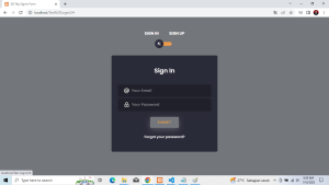
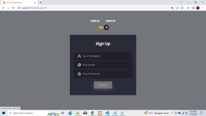
3. Setelah itu jalankan index.html melalui Google Chrome,Mozilla Firefox, Internet Explorer, dan lain sebagainya.
Berikut Tampilan Login Form untuk Sign In dan SIgn Up :